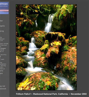
In my last two articles in this series, I talked about planning your business needs then organizing the structure of your site to best meet those needs. Today, I’ll talk about making sure your site and your images look great.
The background color of your site is important. Neutral colors are usually best, which leaves white, black, and shades of grey. Because colors tend to appear more saturated and lively against a dark background than a lighter one, I usually recommend darker greys (but not black) for color photographers, on the other hand, I think white or light grey backgrounds look great with a lot of monochromatic work. Spend a little time experimenting with your own images and different background tones to see just how big a difference it makes.
Getting the color to appear correctly on your customer’s monitor is a challenge in itself, if you haven’t’ missed my article on saturation loss in JPEGs now would be a good time to read it. You’ll need to accept that, for now, you won’t have an hope of a consistent color rendition of your images across the web, but the ideas I presented in that article should help some.
Image size is another conundrum. It’s widely believed that computer monitors display images at 72 pixels per inch, but that’s rarely the case. In practice, I’ve owned laptops that have varied from from about 60 to over 200 ppi., making a 720 pixel-wide image anywhere from four to ten inches wide. If you want your images to display large, but not too large to fit on the screen, the best you can do is to find a size for the images you want to display big and detailed at a pixel resolution that is less than the size of your customers screens. With displays resolutions as low as 1024×768 still being used by about 20% of web users, you’ll need your own images to be no larger than about 800×600 (leaving some room for the web browser, etc.) if you want to be sure your image isn’t “too big to see” on your customer’s screen.
Where possible, stick with ubiquitous, standard web technologies. Tools like Adobe (formerly Macromedia) Flash could help you solve this problem by better handling scaling of your images, but I don’t recommend Flash, at least not yet. Many popular web-browsing devices (such as the iPhone) don’t support Macromedia Flash, many users have Flash disabled or have not yet installed it. Moreover, many ways of creating Flash sites (such as the galleries produced by Lightroom) can’t be configured to work with your site’s navigation.
Finally, edit ruthlessly. Think carefully about how many images you want up on your web site. As I write this, I’m all too aware that I have nearly five hundred images on my own web site. That’s too many. Most customers will never see more than a hundred of them. A careful selection of the very best of those (as subjective as that is) would help the site, and I plan to make that cut over the next few weeks.
This concludes this three-part series on designing your photo business web sites, if you have questions or comments on any of this drop me a line or leave a comment, I’d love to hear them. Thanks!

