If you like this article, you can now get the book! Joe has expanded the “Tuesday Composition” series into an inspiring new ebook on composition, especially for nature photography. Check it out: The Tuesday Composition.
In a previous column we’ve talked about how the eye is attracted to and tends to follow along edges in a scene, and that similarly, the eye tends not to spend much time wandering in the center of silhouetted areas, tending to explore the edges of those areas instead. Both of these ideas are related to the fact that as one looks at an image over time, the eye will spend more time looking at areas of high contrast than areas of lower contrast. If your image is half-solid without texture, and half a simple textured pattern, the viewers’ eyes will tend (depending, of course, on the dozens of other factors that go into human perception) to spend more time wandering around the patterns.
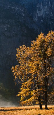
This autumn image from Yosemite Valley demonstrates the principle. As we look at the image over time, our eye spends a lot of time wandering around the tree branches and leaves compared to the shadowed valley walls or the thin strip of foreground grasses. If we were just trying to understand why our eye spends more time on the tree than the valley wall we might think it was just a matter of the tree leaves being highlights that our eyes are attracted to. But here, while our eyes might very well be first attracted to the brightest part of the image (the grasses at the base of the image), the the eye will eventually spend more time wandering the more interesting and complex patterns of the branches. And the large contrast in the tree leaves (both color contrast and tonal contrast) is a primary reason why.
(As an aside, it’s only as I think about this image now that I realize that it might be a good thing that the eye is first attracted to the grasses in this image. While it’s often best to have the eye pulled to the most interesting part of an image. The grasses are not uninteresting, and the eye in this image tends to first jump to the bottom of the image, then start working up the tree before starting to wander to the leaves and branches. That initial vertical motion of the eye, aided also by the vertical shape of the image, emphasizes the sense of scale. We’ll talk more about emphasis, size and scale in future columns.)
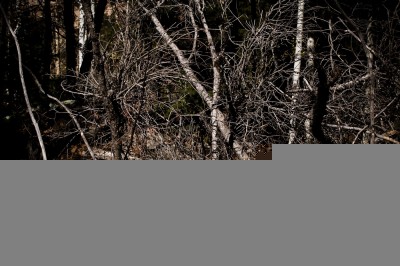
Areas of lots of detail, particularly areas that lack a dominant pattern, tend to leave the eye to wander around chaotically within them without finding a place to settle. It’s interesting to experiment with images that take this idea to an extreme, avoiding any large dominant shapes, lines, or smooth areas.
Dark Chaos is an example of such an image. Despite a few interesting edges, shadows and highlights the eye is left nearly lost in this image, leaving the eye to wander in a futile search for something to rest on. The image does end up “feeling restless” because of this, making the image seem a tiny bit more unsettling, perhaps even a tad disturbing. Also notice that I’ve darkened the edges of the image. In this image this helps hold the eye “within the image” not only because the highlights are only left in the middle of the image, but also because the darkening reduces the contrast of the edges leaving the highest-contrast areas in the center.


Lorenzo Reffo
9 Jul 2009Sounds quite difficult and I think it requires practice! I’m realizing right now that I tend to get everything well lit and this might be the right way for most of the shots, but don’t even thinking of catching another kind of light may be a missing part for a photographer! As I wrote just few minutes before in a response comment on flickr, I’m starting right now to practice silhouettes.. I’d better thinkl to practice this technique too! Thanks for your post!
Joe Decker
9 Jul 2009Thank you, Lorenzo!